Communication
Death by ‘Reply All’
On 25, Jun 2016 | In Communication, Just A Thought | By Joseph H Willis Jr
For some, ‘Reply All’ emails are very helpful because they are meant to keep everyone up to speed on a seemingly meaningful conversation.
Eventually, if you abuse the ‘Reply All’ feature, you may become ignored or misunderstood by recipients over time.
Think if the email should begin as a separate conversation or continued into a chain that may include irrelevant recipients at the moment.
So how do we keep ‘Reply All‘ and other emails to designers relevant, so they are of value and not ignored?
1. Reply All or Individual Conversation –Before you even send out an email, consider the recipients and their time. Everyone in your team does not need to be aware of every conversation every time. Many people do that to cover their bases and may not realize that it causes a sense of overload for a recipient’s inbox.
2. Their name – If you have a question or task for a developer, start off greeting them by name.
3. Relevant Subject Line – Be sure to edit the subject line precisely to the nature of the content.
4. Fewer words as possible – Fewer words, clear and concise is key to effective communication.
5. Spaces and lines – Break up the email so it is easier to read or your paragraphs may cause you to repeat yourself or receive undesired results for a product or task.
As for myself, I am very visual and can become overwhelmed by an abundance of casual email chains. I tend to remedy this with the ‘Ignore Conversation’ button in Outlook®.
Simple Animations in Storyline: Nokia 1020—jwillisjr
On 03, Oct 2014 | No Comments | In Communication, eLearning | By Joseph H Willis Jr
As always, I believe that animations in presentations should be used sparingly and appropriately. People should not fly in from the sides because well, if someone did that in real life that would be very odd. Less is more.
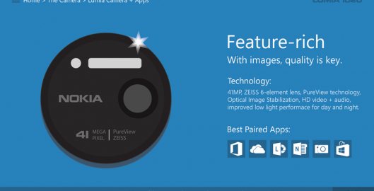
In these examples of the Nokia 1020 I used some animation since we are using objects and logos. I experimented a bit to see what works and what doesn’t.
Quick samples of a few typical animations an a custom flash/lens flare that I developed:
Simple animation with lens flare, text, and squares:


